[Translate to Estonian:] Article for content examples
6. Jan 2019(copy 1)
[Translate to Estonian:] This is the Pagelist extension page type of article. It's a quick and easy way to build smaller scale news sections and blogs for your site.
Besides news/article pages there are event, vacancy and product types. Design your articles with all the content items at hand from media to forms just like regular pages. Authors and contact persons can be set from Personnel records.
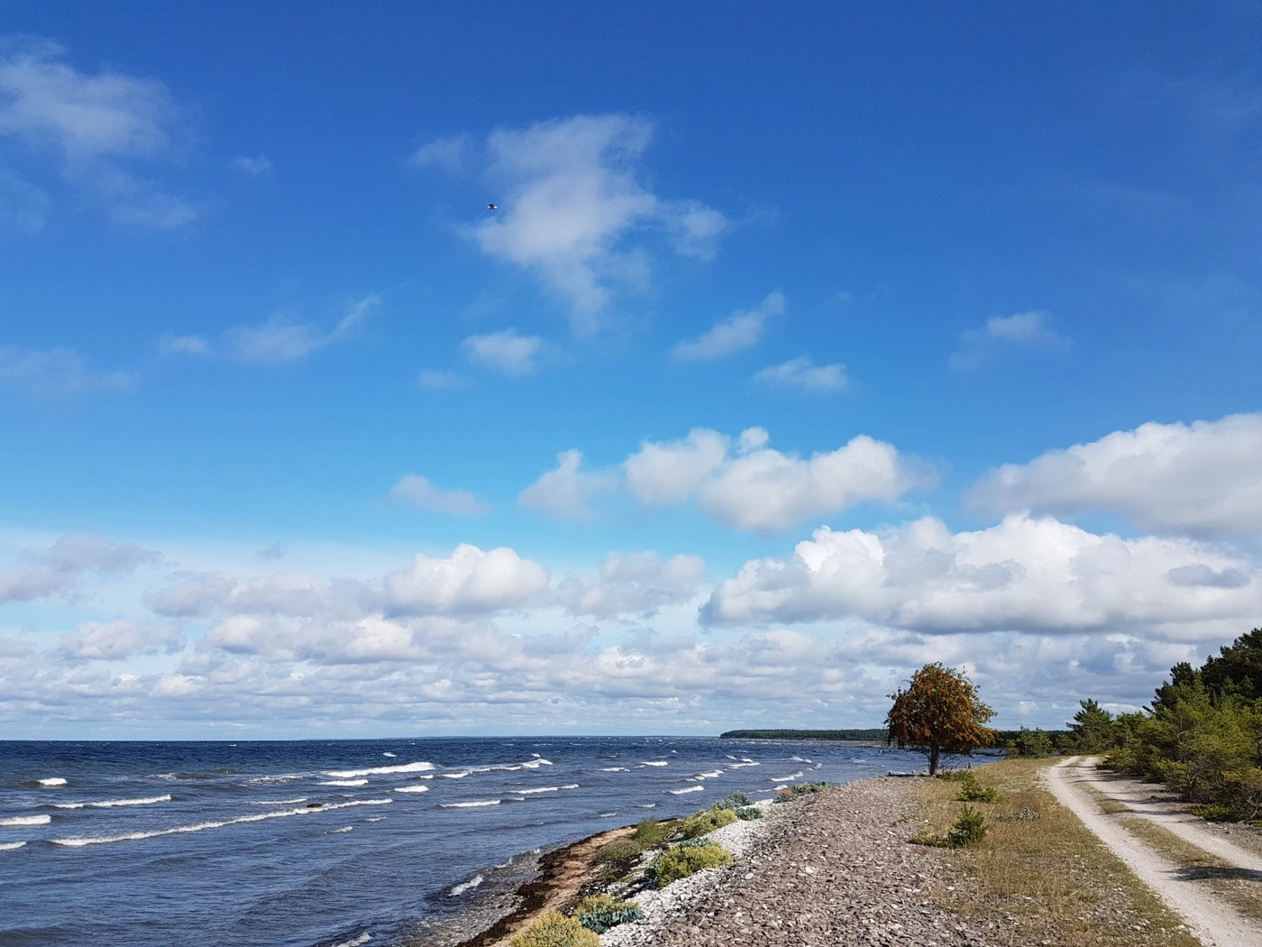
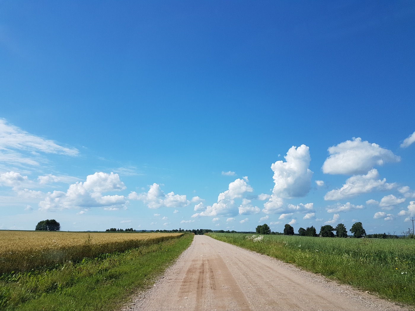
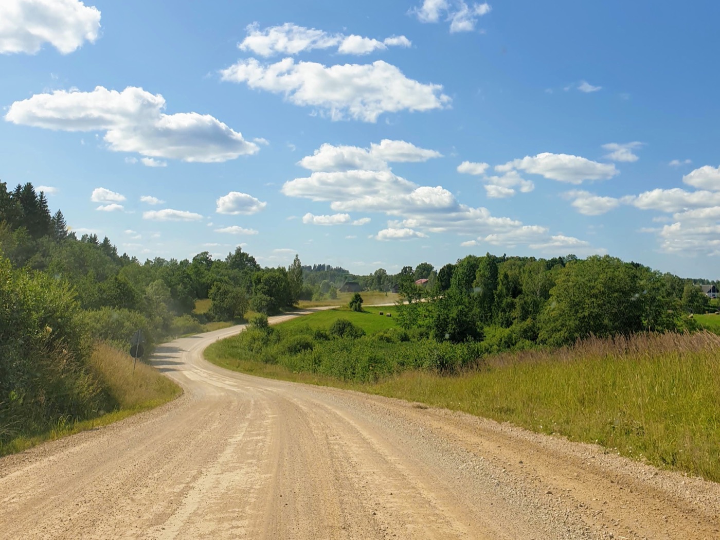
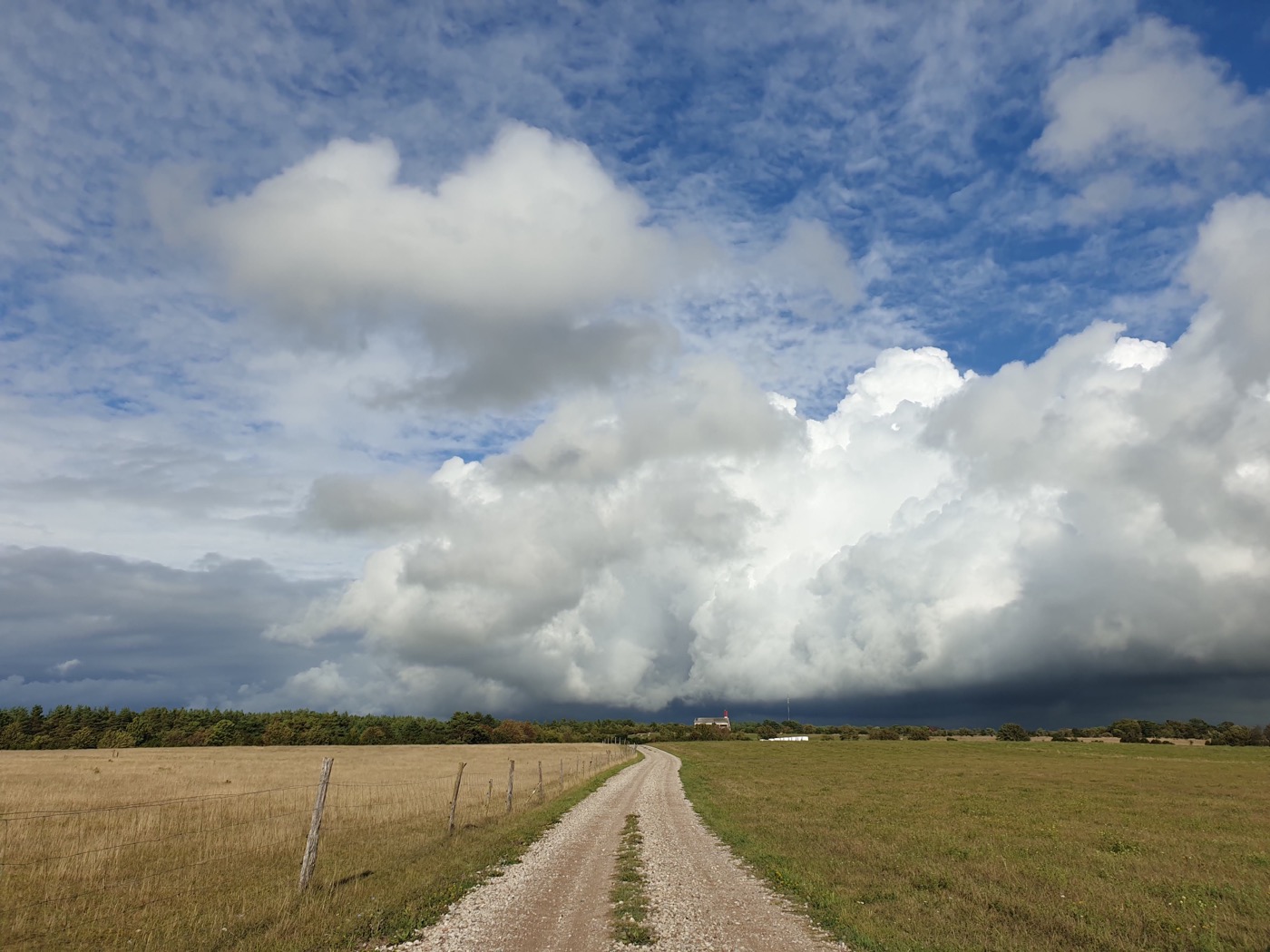
[Translate to Estonian:] Another gallery example
[Translate to Estonian:] There's pagination with anchor setting to keep things in focus. Lightbox JS and CSS is not loaded to your page source if zoom is not activated in gallery.
[Translate to Estonian:] Popups
[Translate to Estonian:] Popups are simple containers on the page pre-filled with content. Opening one is just a matter of creating a link to it. Multiple popups can be opened on top of each other. It's fully keyboard friendly!
- [Translate to Estonian:] First file in the list [Translate to Estonian:] Description to the file goes here. Let's always show the download file name for security reasons. 20170728.jpg ( 327 KB )
- [Translate to Estonian:] Second file in the list [Translate to Estonian:] Description to the second file goes here. Let's make it longer for testing purposes. And see what happens if it's on more than few lines. 20190721.jpg ( 374 KB )
- [Translate to Estonian:] Third and last file has no description 20200904.jpg ( 271 KB )
[Translate to Estonian:] Gathering content into tabs is simple. Just put em into ‘tabs’ container. Pellentesque auctor purus justo, ut accumsan libero ultrices non. Ut eu nisi felis. Vivamus ultrices tincidunt condimentum. Mauris condimentum tristique nisi. Mauris porta risus neque, vitae elementum purus vestibulum ac.
[Translate to Estonian:] First element in accordion can be set open on load
[Translate to Estonian:] Yup, simple as this, content elements in accordion container become accordion items.
Mauris fermentum sit amet est eget porta. Nunc accumsan scelerisque felis a posuere. Etiam faucibus sollicitudin tristique. Sed et lectus in nunc convallis rhoncus. Praesent sollicitudin sem mi, non commodo arcu elementum quis. In sit amet nulla tincidunt enim hendrerit dignissim et sed mi. Pellentesque auctor purus justo, ut accumsan libero ultrices non. Ut eu nisi felis. Vivamus ultrices tincidunt condimentum. Mauris condimentum tristique nisi. Mauris porta risus neque, vitae elementum purus vestibulum ac.
[Translate to Estonian:] Second element in accordion
[Translate to Estonian:] Fusce semper sed magna id semper. Suspendisse non diam tortor. Nullam eget consectetur urna. Curabitur laoreet lacinia lobortis. Vestibulum congue aliquet augue eu tincidunt. Proin et velit non eros laoreet blandit in ut velit. Maecenas porttitor venenatis leo eget malesuada. Lako ta reporio unta nema dscaredo.